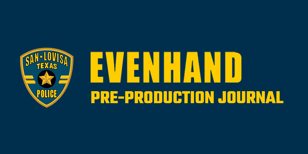
Above you see the upper arm of one of San Antonio’s finest, featuring his SAPD shoulder patch. Note the Alamo, the logo of choice here in San Antonio.
When we initially considered filming EvenHand in San Antonio, one of the first calls we made was to the San Antonio Police Department to ascertain their level of interest in having us come down and use their equipment, personnel, etc. While their reception was as warm as we could have hoped, they did indicate that we would not be able to use or show any of their logos on screen.
We thus had to conceive of a new name for our now fictional Texas city. The first thing that popped into my head was “San Lovisa.” It has the benefit of sounding very Spanish, while actually being the name of my assistant, Lovisa. What makes it especially amusing is that Lovisa is Swedish. We are using a Swedish name for a Texas city.
Once we picked a name, we then began to conceive of a design for the various police logos that will be featured in the film. I told Lovisa, who also does excellent graphic design work, that I wanted the design to be reminiscent of the SAPD logo, but different enough that it would be accepted by the SAPD.
As a cost saving measure, we decided to use the SAPD uniforms instead of creating our own. This will be particularly helpful on the days when we engage actual police officers to play extras in the film; we will not need to measure and fit them for wardrobe — they’ll come with their own. All we will have to do is stick our patch over theirs and give them a new badge. Here’s the first patch Lovisa designed:
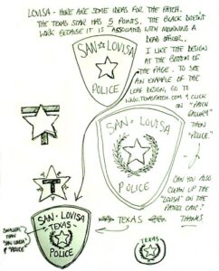
I was in San Antonio when she completed the first patch. While her design was graphically bold, there were a couple of problems. The black band suggested mourning and the Texas star has five, not six points. I also liked the idea of fitting the word “Texas” into the design to emphasize that that’s where we are. Here’s the response I faxed to her:
Here’s Lovisa’s next pass:
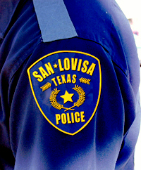
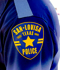
I was pretty happy with the overall design. It was starting to look cop-like. On reflection, though, I felt that the star wasn’t big enough (c’mon man, this is Texas!). She tried to retain the design elements with a bigger star, but the leaf motif got too crowded and stringy. She suggested adding the bars instead. So, here’s the final version. The same basic design will also be used for various signs and decals for the patrol cars.
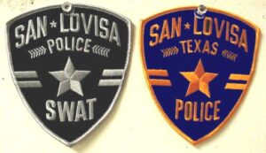
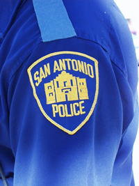
Here are the finished patches
– Joseph Pierson

![]()